welcome to stack
new
stack
[ by monodeaf ]
Welcome to stack, the ultimate hub for mastering advanced website-building techniques, coding, and in-depth knowledge that will elevate your Carrd creations beyond the ordinary. Here, you have the opportunity to break through the limitations often associated with Carrd and push the boundaries of what you can achieve. With access to cutting-edge resources, tutorials, and expert insights, you’ll gain the skills needed to refine your HTML structure, create dynamic layouts, and implement advanced features that make your website not only stand out but also indistinguishable from professionally built platforms. Whether you're aiming for seamless interactivity, sleek design, or just to refine your coding expertise, stack is where Carrd users like you come to transform their projects into polished, high-quality digital experiences.
carrd can do more than you think — if you're bold enough to push it.

MonoDeaf - Musician, Web Designer"I first started out in web design with Carrd, as my record label needed a website. Instead of hiring someone to build one for us, I thought about diving into the project first hand, and immediately fell in love with it. Carrd opened the doors to creating worlds of art and creativity and before I knew it, I was learning code languages to add super cool things in my Carrds to make them stand out. I later used more advanced web builders and started to really understand the structure of websites. Since then, I have created many advanced projects for fun, built dashboards and components, and so much more, and I wouldn't have been here if it wasn't for Carrd."
WHAT'S IN HERE?
COMPONENTSLearn how to create engaging and interactive elements to elevate the design and functionality of your Carrd website. Explore techniques to incorporate features like buttons, sliders, image galleries, and scrollable text boxes, making their sites more dynamic and user-friendly. Each component covers essential CSS and HTML tweaks that work within Carrd's settings, allowing for easy customization and styling. By mastering these components, you can enhance their site's visual appeal and improve overall user experience, helping your Carrd website stand out from the rest.
MARKETINGBuilding your Carrd website is only half of the battle. Once you've finally put the last pin in place, you'll need to get the word out. Set your marketing in motion with various techniques and tools that can expand your site to new eyes, and look good at the same time.
CSS & JAVALike typing? Good. CSS is your go-to guide for using advanced CSS techniques within Carrd's embed element, allowing you to create unique embeds and custom inline elements. Here, you’ll learn how to add creative styling, animations, and additional functionality with JavaScript to elevate your site’s look and user experience. With these skills, you can seamlessly enhance your Carrd website’s design with custom, polished touches.
KNOWLEDGELearn helpful information on the basics of web design and how Carrd utilizes modern techniques to build websites.
TL:DR = COOL SH✱T IS IN HERE
Updates & information
• 5 - 23 - 26
Changes:
– Edited "Lenis Scroll Smoothing" monologue.
– Edited "Custom Scrollbar" monologue.
– Added monologue -> "Liquid Glass In Carrd".
• 5 - 24 - 26
Changes:
– Edited "Liquid Glass In Carrd" monologue.
— Added tool resource "Artkit".
— Added tool resource "Spectrums SVG".
• 5 - 25 - 26
Changes:
– Updated "Other Projects"
monologues
Deep-cut Carrd knowledge — advanced designs, smart functionality, and power-user hacks
The "side-by-side container" Theory
Carrd keeps things simple, which is awesome, but sometimes, you’ll want to do stuff it doesn’t technically let you do out of the box. One common request – putting two containers side by side. This isn’t really a standard thing in web design (even on fancy platforms), because containers are usually placed in a vertical linear fashion and act as a parent block with proper padding to hold elements.⊢ Section
⊢ Container
⊢ Div Block
⊢ Item (text/image/etc)
Understanding Containers and Div Blocks:In Carrd, a container is just a box that holds stuff, like text, images, buttons, whatever – by default however, it stacks everything vertically.If you add columns to a container via in the settings panel of the container, each column is its own <div> block in the HTML of the live site.
So, to recap:Containers = the big boxColumns = div blocks inside of the big boxWhile these div blocks are not the containers we hoped for, they can be styled with custom CSS code to look like they are containers.
Customizing Div Blocks with CSS:Here’s how you make those columns feel like true side-by-side containers:Inspect the Code: Right-click your page and hit "Inspect" (in Chrome or Firefox). That lets you peek under the hood and see the div blocks that are the "columns".Each div block has their own ID or class. Think of this like giving a specific name to the div block so that they can be located with CSS. Usually, they are given selectors such as .container-instance-1, or .container-instance-2 and so on.Add Custom CSS: Once you’ve figured out which div is which, go back to Carrd and toss your CSS into an Embed element. You can give each div padding, background colors, borders, shadows—basically dress them up however you want. I've provided some example code on how I've styled the div blocks in the images below.This gives the illusion of two legit containers sitting next to each other—even though they’re just styled divs inside one container.

see more ◱
see more ◱

see more ◱


<style>
#container21.columns > .wrapper > .inner {
justify-content: space-between;
height: 100%;
}
#container21.columns > .wrapper > .inner > div:first-child {
background-image: url("https://images.unsplash.com/photo-1518965539400-77d851d65c43?q=80&w=2574&auto=format&fit=crop&ixlib=rb-4.0.3&ixid=M3wxMjA3fDB8MHxwaG90by1wYWdlfHx8fGVufDB8fHx8fA%3D%3D");
background-repeat: no-repeat;
padding: 1rem;
overflow: hidden;
width: 49%;
height: 100%;
border: 1px solid #1E1E1E;
}
#container21.columns > .wrapper > .inner > div:last-child {
background-image: url("https://images.unsplash.com/photo-1519638399535-1b036603ac77?q=80&w=2662&auto=format&fit=crop&ixlib=rb-4.0.3&ixid=M3wxMjA3fDB8MHxwaG90by1wYWdlfHx8fGVufDB8fHx8fA%3D%3D");
background-repeat: no-repeat;
padding: 1rem;
overflow: hidden;
width: 49%;
height: 100%;
border: 1px solid #1E1E1E;
}
</style>
Facebook sharing button
If a user really enjoys your website and would like to share it to some friends on X (Twitter) or Facebook, lets take a look at the steps needed to share your website.1. Copy the websites URL from the browsers address bar.2. Close out of the browser.3. Open the application.4. Select the option to create a new post in the application.5. Paste the copied URL into the text field of the post.If this seems tedious, thats because it is. Users would have to be die-hard fans in order to go through this process just to share your website to friends on X or Facebook, but what If I told you that this can all be done with one click? and better yet, involves not even a single line of code?One of the most overlooked techniques to increase visibility of a website is by adding share buttons. These are commonly seen on websites with news articles or blogs, where users can quickly share a websites article to social media. Allowing users to quickly and efficiently share your website can be very beneficial to grow your websites reach to new eyes. Let's go over this popular technique — Share Buttons.Let’s go over a Facebook share button. Add a button element to the page, and add the label for the button, “Facebook”. You may also just use an Icon element, using the Facebook Icon if you’d like to. Next, we will need to adjust a specific URL that we will be using as the button’s URL. This URL is:https://www.facebook.com/sharer.php?u=example.comAt the end of this link (after the ‘u=’), replace the example URL with your websites URL. Once that is done, it is a good idea to include “||blank” at the very end, as this will open the application in a new tab, preventing your website from being overridden by Facebook, causing users to lose your website.If done correctly, the link you'll be placing in your button is:https://www.facebook.com/sharer.php?u=yourwebsitehere.com||blankPublish your changes and check out your new Facebook share button. Once clicked, it should open the Facebook webpage or application (users must be logged in), and display a prefilled post containing the link to your website that is ready to share. This can be a substantial time saver for users who want to spread the word of your awesome Carrd website, and add an extra touch of interactivity.
Step 1
Add a button element to the page.
Step 2
Apply the adjusted URL -https://www.facebook.com/sharer.php?u=yourwebsitehere.com||blank - to the button or icon element.
Step 3
Publish the website and test.
X (Twitter) sharing button
Let’s go over an X (Twitter) share button. Add a button element to the page, and add the label for the button, “X”. You may also just use an Icon element, using the X Icon if you’d like to. Next, we will need to adjust a specific URL that we will be using as the button’s URL. This URL is:https://twitter.com/share?url=example.comAt the end of this link (after the ‘u=’), replace the example URL with your websites URL. Once that is done, it is a good idea to include “||blank” at the very end, as this will open the application in a new tab, preventing your website from being overridden by X, causing users to lose your website.If done correctly, the link you'll be placing in your button is:https://twitter.com/share?url=yourwebsitehere.com||blankPublish your changes and check out your new X share button. Once clicked, it should open the X webpage or application (users must be logged in), and display a prefilled post containing the link to your website that is ready to share. This can be a substantial time saver for users who want to spread the word of your awesome Carrd website, and add an extra touch of interactivity.
Step 1
Add a button element to the page.
Step 2
Apply the adjusted URL -https://twitter.com/share?url=yourwebsitehere.com||blank - to the button or icon element.
Step 3
Publish the website and test.
Custom Scrollbar
Browsers use built-in scroll bars to navigate horizontally or vertically through webpages, and if you ask me, they don't look that great.
A custom scroll bar on a website enhances user experience by aligning with the overall design aesthetic, creating a cohesive and visually appealing interface. It allows brands to reinforce their identity through unique colors, styles, or animations, making the site more memorable. By tailoring this often-overlooked element, websites can elevate both form and function, leaving a lasting impression on users.
Step 1
Add an embed element anywhere on the page, preferably at the top so it doesn't get lost in content.
Step 2
Leave the 'Type' setting to Code, and set the 'Style' to Hidden > Head.
Step 2
Apply the code (given below) to 'Code' field.
<style>* {
-webkit-tap-highlight-color: transparent;
}::-webkit-scrollbar {
width: 8px;
height: 6px;
color: #000000;
background-color: black;
overflow-x: hidden;
}::-webkit-scrollbar-thumb {
background: #888888;
}
::-webkit-scrollbar-thumb:hover {
background: #f1f1f1;
cursor: pointer;
}
::-webkit-scrollbar-button {
width: 0px;
height: 0px;
}</style>
Step 4
Customize the look with different colors, width, height and adding border-radius.
Want to make the scrollbar disappear for that maximum clean look? Try this:
<style>html {
scrollbar-width: none;
}</style>
Does the page still scroll? Isn't this bad for accessibility?
The page still scrolls like normal, and it may take a notch off of accessibility — some users may need a scrollbar to maneuver through your page. Every choice like this is subjective to design decisions. It's your turf.
Want to keep the original look of the scrollbar, but force it's style to a native dark-theme? Try this:
<style>:root {
color-scheme: dark;
}</style>
Importing Lenis Smooth Scrolling
You know those professional websites with that "premium" feel to them? That premium feeling often comes from an ever-so-light scrolling animation that can definitely make a website feel polished and weightless. A popular resource that these websites use for that ability is Lenis.
Lenis is a free, open-source project that allows a website to have a smoother scrolling experience, along with scroll-triggered animations. Let's go over adding Lenis to your project.
Step 1
Add an embed element anywhere on the page, preferably at the top so it doesn't get lost in content.
Step 2
Leave the 'Type' setting to Code, and set the 'Style' to Hidden > Head.
Step 2
Apply the code (given below) to 'Code' field.
<style>html {
scroll-behavior: auto;
}</style><script src="https://cdn.jsdelivr.net/npm/@studio-freight/lenis@latest/bundled/lenis.js"></script><script>
const lenis = new Lenis({
lerp: 0.05,
smooth: true,
wheelMultiplier: 1,
smoothTouch: false,
touchMultiplier: 2,
});function raf(time) {
lenis.raf(time);
requestAnimationFrame(raf);
}requestAnimationFrame(raf);
</script>
What does this do?
This code imports and initiates a basic Lenis script, ready to simply make scrolling much smoother. Different parameters can be added to the script to achieve different functions, but with these settings provided, Lenis works right out of the box with minimal code needed.
Step 4
Publish and test.
Step 5
Adjust certain parameters in the code to control how reactive and smooth the scrolling feels on the pages:• Lerp: "0.1" is default. This controls the Linear interpolation (lerp) intensity (between 0 and 1). A lower number (0.075 or 0.05) will create a smoother/softer scroll experience, but too low can make the site feel sluggish. A Few Important Things To Keep In Mind:• scroll-behavior on the html parent should be set to "auto", as "smooth" is known to interfere with and disrupt the Lenis Smooth Scroll script. The code provided above already addresses this - so you don't need to worry about this issue, but it's something to keep in mind - as any "scroll-to-top" button or button that scrolls to a section of a page, will ultimately snap to the section, instead of scrolling, if scroll-behavior is set to anything other than "smooth", so it's a design decision you'll have to make. You can change scroll-behavior to "smooth" to test if this parameter has no affect to Lenis on your project.• For any scrolling elements, for e.g. a scrolling text block, it will not be scrollable by default with Lenis. In order to have the scrolling element scrollable with Lenis, you will need to add the attribute...data-lenis-prevent=""The attributes can be found near the bottom of the settings tab (gear icon) of the element in Carrd's editor.• Be sure that the site is optimized as much as possible (all images are compressed, minimal unnecessarily large calculations such as drop shadows, blur, etc) before applying Lenis for smooth performance.• If using Lenis, avoid using Carrd's native parallax feature for container background images at ALL COSTS. Setting a background image of a container to have a parallax effect will add a scrollTracking script to the live site. This scrollTracking script writes --scroll-Y to the <html> of the page on every scroll, and is used to calculate the viewport's position relative to the container's position to achieve the parallax effect. With the scrollTracking script and Lenis both tracking scroll position, reflow errors occur and your site's PERFORMANCE WILL TANK.• Occasionally, projects with Lenis will not auto-scroll to the top of the page when clicking a link to a new section. A current quick-fix is to add Lenis.scrollto(0); or lenis.scrollTo(0, { duration: 0, immediate: true }); to the button or link's onclick code, usually found as an input field labeled onclick below the links URL input field.
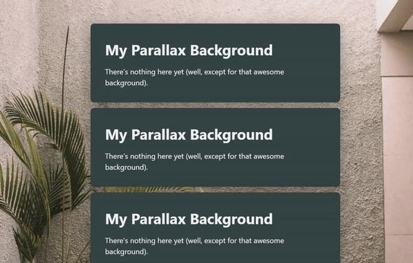
Full Parallax Background
A parallax background is a perspective effect where the background moves at a slower rate than the scrolling speed of the webpage, increasing the effect of distance between the content and background. While Carrd provides an easy way to apply parallax to containers, it is currently not possible to apply a parallax effect to the background of the website. Let's utilize the power of CSS to create a full background parallax effect.
Step 1
Add a container to the website, preferably at the top.
Step 2
Be sure that this container's style set to None. This container will be used as the background.
Step 3
Set the container's background to Image, and choose an image.
Step 4
Set the image's position to Top, the size to Fill, and the parallax to Slow.
Step 5
Open the container's settings menu by selecting the gear icon. Under Style and Default, apply the CSS (given below) into the custom CSS field.
position: fixed;
top: 0;
left: 0;
min-width: 100vw;
min-height: 100vh;
z-index: -1;
Step 6
The container should now be in the background with the width and height set to the screens appropriate width and height. The container's parallax image should still be responsive to the scrolling position, moving slower than the scrolling speed.Keep In Mind:• The page's background will be hidden by the container.• Use a fairly good high resolution image for the background, as it will be zoomed in for the parallax effect. A good place to look for images is on Unsplash.
Download Buttons
Carrd lets you add buttons and even a little “download” icon—but here’s the catch: you can’t actually host downloadable files on Carrd itself.
There’s no built-in file storage or server access, so if you were hoping to upload a file and let users download it directly—nope, not happening.Normally, when you click a “Download” button on a website, it’s grabbing a file that’s hosted on a server. That server delivers the file straight to your browser.
But with Carrd, we don’t get that luxury, as we’re not hosting files, we’re just designing around that limitation.But don’t worry, we can achieve a similar function!
The Workaround: Using Google Drive for Download ButtonsHere’s how you do it:
Step 1
Upload your file (PDF, ZIP, MP3, whatever) to Google Drive.
Step 2
Hit “Share” and make sure the file is set so anyone with the link can view it.
Step 3
Copy the share link, then go to this converter site
https://sites.google.com/site/gdocs2direct/
This tool turns your normal Google Drive link into a direct download link—meaning when someone clicks it, the file downloads immediately.
Step 4
Now slap the link that was received -- into a button or icon in Carrd.
You've now got yourself a download button!Heads-up: Keep your Google Drive files tidy and don’t delete them by accident—your button won’t work if the file disappears.
Bonus: If you ever need to update the file, just replace it in Drive and the link will still work.
Striped Backgrounds
Striped backgrounds are an awesome way to add visual texture to blocks while keeping the content front and center. They can create a sense of depth without overpowering the design. Using brighter colors, like red, can even draw extra attention to key elements, making them perfect for highlighting important sections.While you can manually add CSS styles to each element’s advanced settings, there's a better way. In this tutorial, we'll create a reusable class that automatically applies the striped background effect. That means any element using the class will instantly inherit the look - no extra setup needed.
Step 1
Head over to this striped background CSS generator
https://webspe.net/tools/en/stripe/
This tool lets you create a custom striped background effect, along with providing the corresponding code snippet for the class.
Step 2
Create your own stripped background effect. Once completed to your liking, copy the provided code snippet.
Step 3
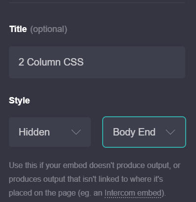
In the Carrd editor for a project, add an embed element (preferably at the top).• Leave the type as Code.
• Add a title (optional)
• Have style as Hidden > Head
• Paste the code snippet (received from striped background CSS generator) into the code block
Step 4
For any element you would like to have the newly added striped background styling, head to the element's advanced settings (gear icon). In the "classes" section, select Add class and enter the name of the class used in the code snippet (default is "stripe").
Scrolling Box For Text
Creating a scrolling text box in Carrd can be a simple and effective way to display lengthy content within a small, scrollable area. Because the text element is inside of a <div> tag, we can set the height of the text block and use CSS to control the overflow behavior to add a scrollbar and even style it to match the rest of your design. Here’s a step-by-step guide to doing this with CSS in the text element’s advanced settings.With these simple adjustments in Carrd's text element settings, you’ll have a clean, scrollable text box that’s both functional and visually appealing.
Step 1:
In your Carrd editor, add a Text element where you want the scrolling text box to appear.
Step 2:
Click on the Text element and head over to Settings (Gear Icon).
Step 3:
To create the scrolling effect, we’ll add custom CSS in the Style settings:Set the Box Height – Define a height to limit the text area. This must be smaller than the total height that the text reaches to, or else the scrollbar will not appear. For example, If the content in the text reaches 5rem in height, you must define the height less than 5rem.Use overflow: auto to allow scrolling within the box.Add Custom Styling (optional) – You can add styling such as borders or background color to enhance the look.Example Styles: Add the CSS codes (one per line) into the code field to see what they do to the text element!
- height: 150px;: Sets a fixed height for the text box. Adjust this to your desired height.
- overflow: auto;: Allows the text box to scroll if the content exceeds the set height.
- border: 1px solid #ccc;: Adds a 1-pixel border around the box in a light gray color.
- padding: 10px;: Adds space inside the box for readability.
- background-color: #f9f9f9;: Sets a light gray background for the text box.
Dummy Icons & Buttons
Some moments - you wish you could display an Icon element or Button element, but not in a functional or interactable way — just having the elements for the looks, rather than a clickable thing. Luckily, that's possible in Carrd.
Step 1
Add an Icon element or a button element to the page.
Step 2
In the elements settings on the first tab, add "browser:none" into the URL field.
Done! The icons or buttons are now just there. They dont do anything, even if you click on them. The element's cursor CSS parameter also changes to default, so when hovering the elements, the cursor doesnt even change to a pointing hand. The icon or button is now truly just for the looks, rather than an interactable thing.
Clip Paths
A clip path is the effect of cutting out portions of an element to create it's shape. This is different from border-radius, as instead of adding curvature to corners, clip-path creates points on where to snip the element - cutting through and clipping out the portions.
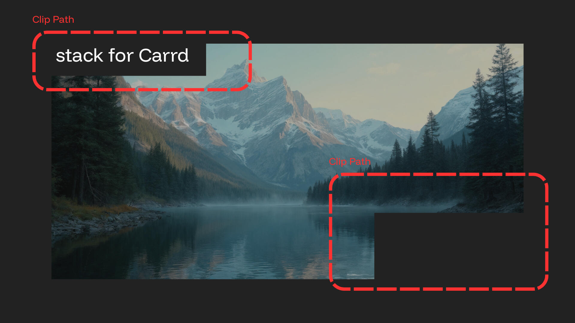
Some developers on high-end website builders achieve this look by using an SVG as a clip-path image via URL to apply to an image or element, and others may achieve this look by taking an image, opening a separate program such as Photoshop, clip out portions of the image and bring it back to the website as an SVG file (although this is like - totally cheating and not really a clip-path). While this works, it involves more tools, and the process needs to be repeated if you want to change the image being clipped. I've thought of different ways to achieve this effect in Carrd. Something easy to work with, and the image can be hot-swapped without effecting the clip path. Introducing...
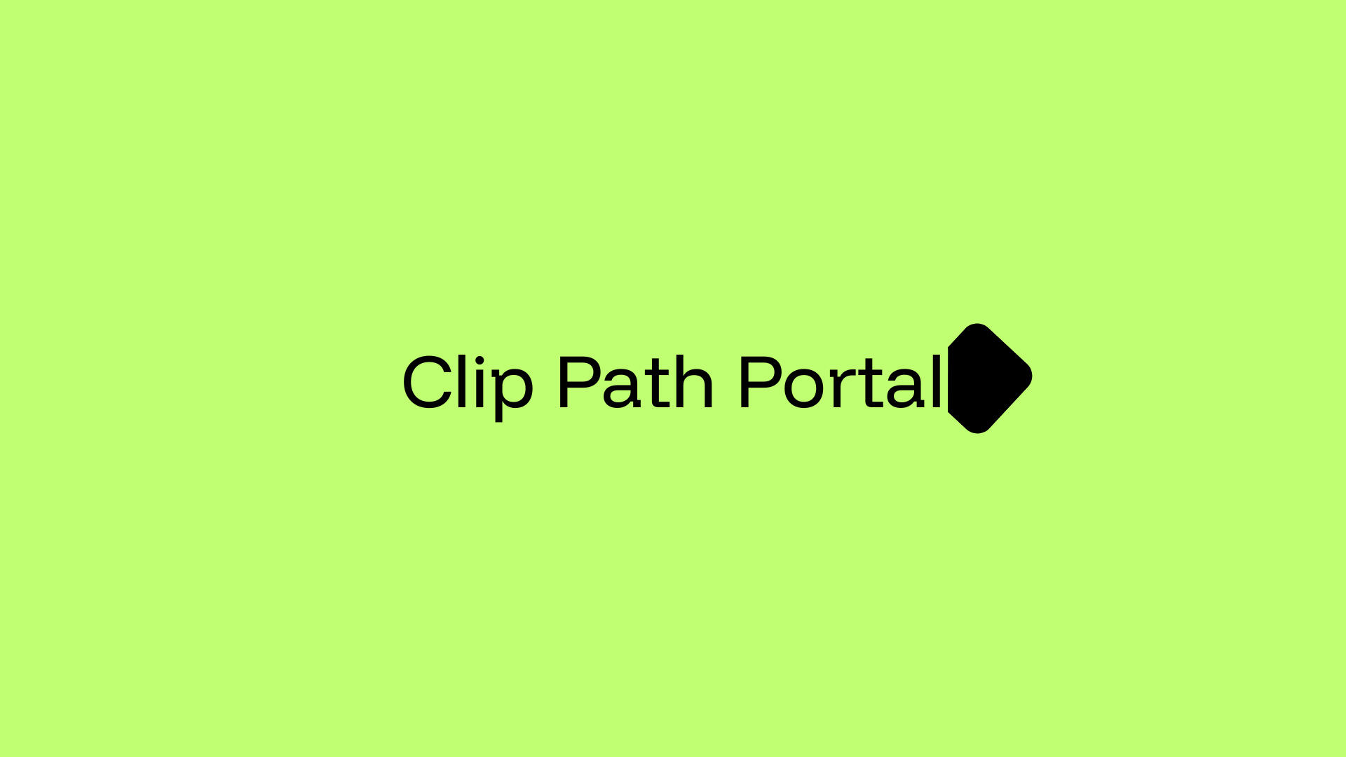
I figured if a clip path is just points on where to snip the image - why not increase the amount of points to create smooth curvature in cuts? Other clip path creating cools dont have much flexibility on smooth edges and shapes - while Clip Path Portal does.
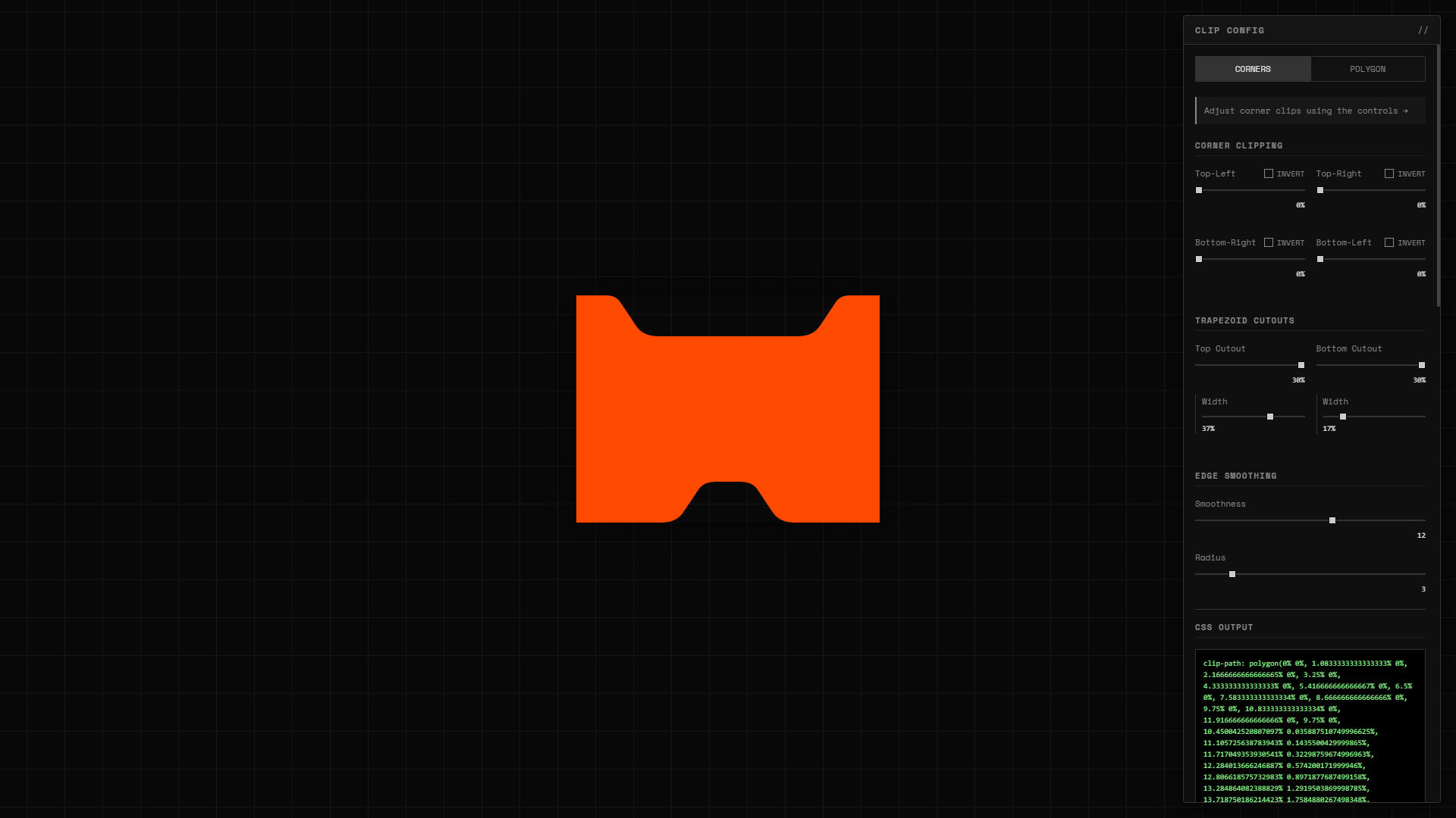
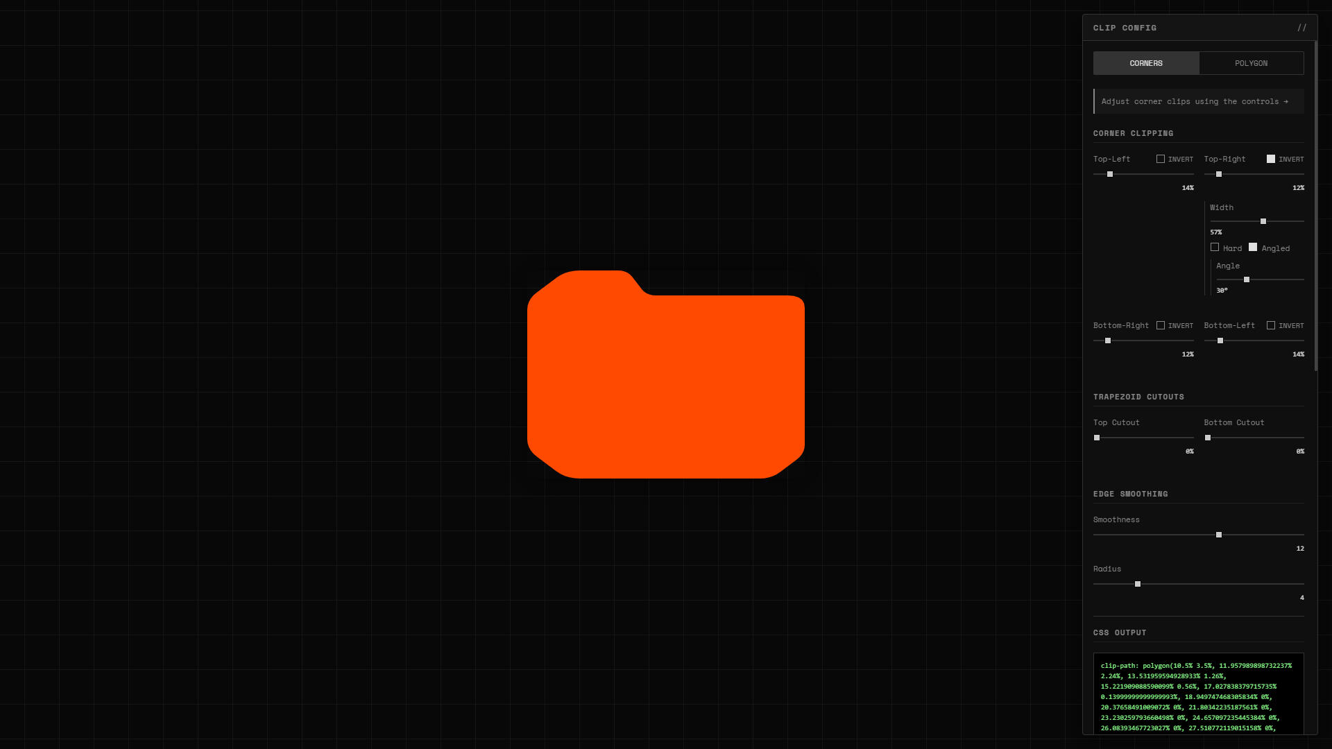
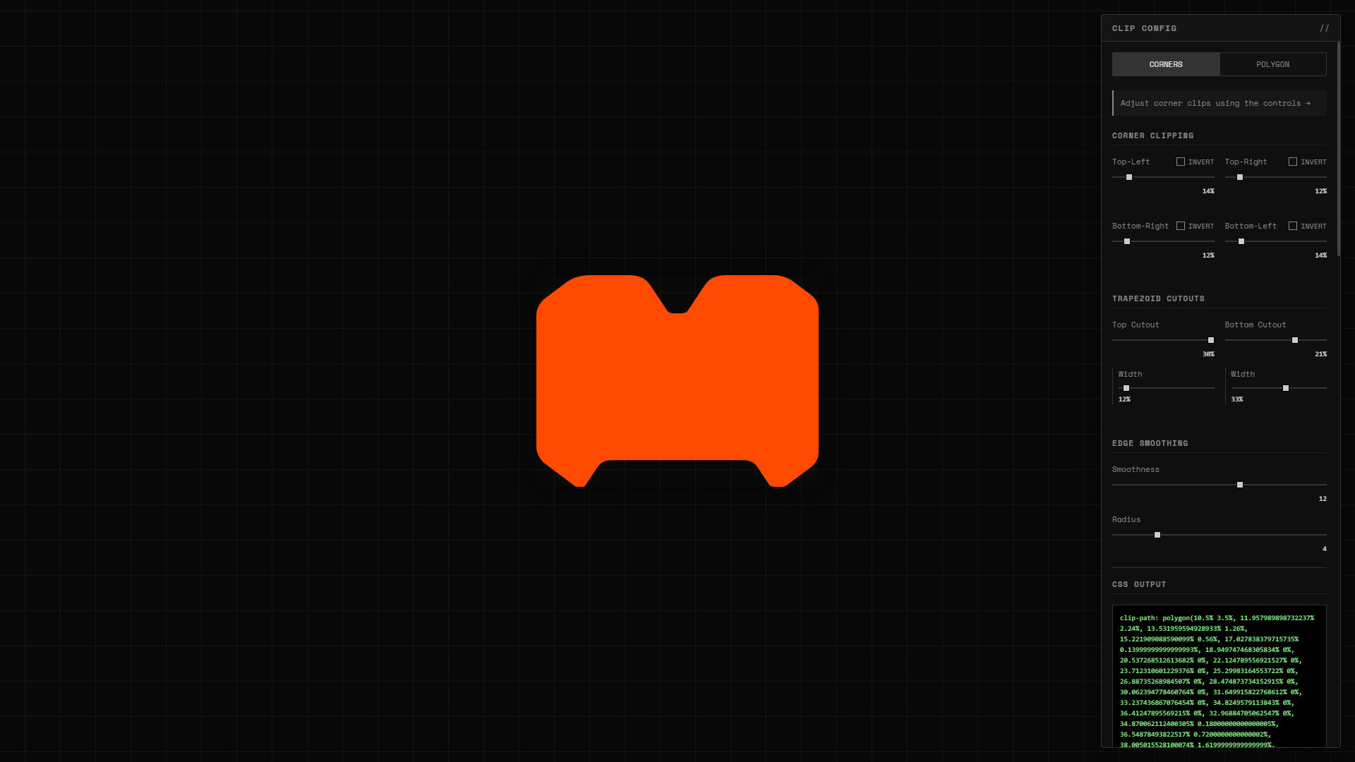
Once you have created a clip path you are happy with — select "COPY CSS" at the bottom of the clip config menu. This copies to created clip path to your clip board, to which you can then paste into the advanced settings (gear icon) of an image element to see those smooth, crisp, clipped edges on the image! The clip-path code can be quite lengthy depending on the shape, but thats the idea – the code holds all of the clip "paths" created to make the shape in the preview.To match the edges of the element with the clip path - you can just add border radius for the final look!You can apply the clip path to more than images as well, like text elements with large padding and a background color.
This Entire Thing Is A Text Element
Add a text element, open the advanced settings and add a background color, large padding and some border radius. Also, look at the bottom right corner - a clip-path!
Liquid Glass In Carrd
Everybody and their momma knows what Liquid Glass is, Apple’s UI breakthrough that completely changed how interface elements interact with the content behind them. By dynamically refracting and distorting backdrop layers, it creates an almost physical glass-like effect across pills, buttons, icons, and other foreground elements.Recently, designers and developers have been recreating this effect on the web using SVG displacement filters and advanced rendering tricks. Most of these experiments, though, have been aimed at self-hosted projects or larger website builders.I had a different goal: bringing Liquid Glass to Carrd.Surprisingly… it works really well.This repo is proof that even Carrd can handle convincing liquid glass effects smoothly and beautifully — opening the door for far more advanced UI experimentation on a platform most people underestimate.
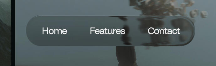
My repo (https://github.com/MonoDeaf/glass-engine) holds my custom liquid glass engine – available to import into any Carrd project to start creating liquid glass elements with a single class.
Step 1
Add an Embed element on the page, preferably at the top so it doesn't get lost in content.
Step 2
Leave the type as "Code", set style to "Hidden > Head", add a name (optional for organizing), and paste this code into the code block:<script src="https://cdn.jsdelivr.net/gh/MonoDeaf/[email protected]/glass-engine.js"></script>
Step 3
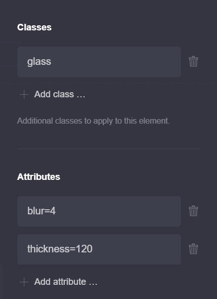
Open the settings tab (gear icon) of an element you would like to attach liquid glass to, and enter "glass" into the Classes section.
For the best results with the liquid glass engine, the element with the "glass" class for attaching liquid glass should be floating in front of content, requiring position: fixed with a higher z-index. Great examples can be fixed navigation pills, floating buttons, popup modals, etc.To customize specific properties of the liquid glass, attributes can be used on the same element to change these properties:radius=2 Radius overrides the border-radius of the liquid glass element. "radius=999" is good for full radius pill elements.
bezel=45 Bezel is the distance from the edges of the element refractions can be seen.
blur=2 Blur is the backdrop-blur effect for the liquid glass effect.
refract=1.45 (between 1 - 2) Refract controls the intensity of refraction around the bezel.
thickness=85 Thickness controls the percieved thickness of the glass effect.
shadow=20 (or 20px) Shadow adds a premade boxshadow to the element.
brightness=0.75 Brightness controls the backdrop-filter brightness effect to increase or decrease background content brightness.Feel free to play around with these attributes by placing them in the attributes input found in the settings tab (gear icon) of the element.
Creating Cards With Text Elements
Creating text cards out of text elements is super straight forward. We take a basic Text element and apply some CSS to make it appear like a card.
Since a text element appears as a <span> in the HTML of the page, it can contain padding for inside-spacing, border-radius for curved edges, and a background color as well – without even requiring an embed element.
Step 1
Add a Text element to the page.
Step 2
Go to the advanced settings (gear icon) of the text element. The input fields under style > default is where we can apply CSS to stylize the text element.
Some CSS to get started:padding: 4rem;
background-color: grey; (or a hex color, such as #FF4A00)
border-radius: 16px;
border: 1px dashed #808080; or outline: 3px solid #808080;Want to rotate it a bit?
rotate: 5deg;
This Entire Thing Is A Text Element
Add a text element, open the advanced settings and add a background color, large padding and some border radius.
Lookin' good! We can even take this a step further and stylize the different markdowns to really make the card pop!If we apply different CSS styling to the Text: Bold of the Text element's advanced settings, we can change the bold markdown text to however we want. Take a look at this example below:
MAKE COOL
SH❋T BRO
Add a text element, open the advanced settings and add a background color, large padding and some border radius.
Text CSS:background-color: transparent;
padding: 5rem;
border-radius: 8px;
border: 1px solid white;
outline: 1px solid white;
outline-offset: 5px;
overflow: hidden;Text: Bold CSS:font-size: 9.5rem;
font-weight: 700;
padding: 0;
line-height: 0.8;
letter-spacing: -10px;
z-index: -1;
white-space: nowrap;
opacity: 0.05;
position: absolute;
top: -7rem;
left: -7rem;
With these CSS styles set for the bold text, any text we give a bold markdown (which is adding ** at the beginning and end of the text, for e.g. **HelloWorld**), is now a cool big, bold background layer for the card!
fonts
Recommended fonts in Carrd. Type in the field to test the font.
Recommended Fonts
Manrope
Monsterrat
Poppins
Inter
Suse
Special Gothic Expanded One
DM Sans
Funnel Display
Instrument Serif (with Italic style)
Space Grotesk
Geist
knowledge base
Knowledge is power!
Making templates? Don't do this:
If you’re building Carrd templates, avoid faking interface elements using images. A common example is star ratings. Five stars look great in a demo, but when they’re just an image placed into a template, they don’t actually belong to the template itself. Carrd templates don’t ship with images and video media. When someone purchases a template and opens it, every image and video element is an empty placeholder. That means those stars you added for presentation disappear immediately.So what was the point of including them?This is where a lot of templates fall apart. They look polished in previews, but once opened, key elements are missing because they were never real components to begin with. The better approach is to use glyphs instead of images.A star doesn’t need to be an image. It can be a character ★. Characters are text, and text does ship with a template. Star glyphs, checkmarks, icons, and simple UI indicators should be built using text so they remain editable, scalable, and actually usable for the person who bought the template.Using glyphs means the element exists when the template is opened. It respects font styles, color changes, accessibility settings, and user customization. Most importantly, it teaches the user how the element is built instead of pretending it’s something it’s not.Templates should demonstrate structure, not simulate it. For any special character that template makers may believe to be out of reach, I recommend checking out Glyphy first.Designing templates isn’t just about how they look in a demo. It’s about what the user actually receives.Build things the way they’re meant to be built.
Websites are just <code>
Websites might look like magic, but at the end of the day, they’re really just made of code - mostly HTML for the structure and building blocks, CSS for the looks and style, and maybe a sprinkle of JavaScript when you want things to move, react, or ya' know - do something.Under the hood, Carrd is still generating the code that your project is made of, just without you having to wrestle with it directly. This makes the process fun, fast, and beginner-friendly.I think it's important to understand what websites are made of, as by seeing the inner-workings of a website - allows you to make much more sophisticated projects, even with Carrd. By knowing HTML, CSS, and "some" Javascript - Carrd doesn't seem so "limiting" anymore. In fact - I prefer to customize elements using the embed element, rather than using Carrd's provided settings, as I feel to have more control and freedom over how I want an element to be styled, including making my own custom animations for them, rather than choosing from Carrd's animation presets.
Sizing In Carrd
Carrd is designed to make one-page websites look polished and perform well across all device sizes, from desktop to mobile. One of the key ways Carrd achieves this is by using a modern sizing unit called "REM" (root em). This unit is a CSS measurement based on the root font size, making it easier to keep elements and text proportional and consistent on different screen sizes.What is REM?
The REM unit stands for "root em" and is based on the font size set for the root of the document—usually the <html> element in a webpage. By default, this root font size is set to 16 pixels in most browsers. When we say "1rem = 16px," we mean that 1 REM unit will equal 16 pixels if no changes are made to the root font size. Carrd leverages this by sizing elements in REMs so that all components scale relative to this root size.For example:If you set a heading size in Carrd to 2rem, it would equal 32px (2 times the root size of 16px).
Setting text to 0.75rem would make it 12px (0.75 times 16px).
This makes it easy to maintain consistent scaling throughout the site. If the root font size is adjusted (say to 18px for accessibility), every REM-based element scales automatically without extra changes needed.In essence, Carrd’s use of REM and EM units ensures that all the elements on your site — from text to buttons and layout components — scale gracefully, providing a smooth experience for visitors on any screen size. By using REM, Carrd gives users a responsive foundation to build professional, adaptable landing pages that look clean and consistent everywhere.
Inspect Is Your Friend
Carrd is a popular platform for creating simple, yet beautiful one-page websites. Whether you're designing a portfolio, landing page, or personal site, Carrd offers an easy-to-use interface with a range of customization options. But for those who want to dive deeper into their site's functionality, the browser's "Inspect" feature is an invaluable tool.Understanding the Inspect Feature:
The "Inspect" tool (often accessed by right-clicking on a webpage and selecting "Inspect" or "Inspect Element") is a built-in feature in modern web browsers like Chrome, Firefox, and Edge. It opens a developer console that allows you to view and interact with the HTML, CSS, JavaScript, and other elements of a webpage in real-time.For Carrd website users, this tool can be a game changer. While Carrd provides an intuitive visual editor, the Inspect feature enables you to go beyond the surface and understand exactly how your website is structured, how it functions, and how to troubleshoot issues when they arise.Why You Should Use Inspect on Your Carrd Site:
Troubleshoot Layout and Design Issues
Sometimes, elements on your Carrd site might not look or behave as expected. With the Inspect tool, you can inspect the individual HTML elements of your site, view their CSS styles, test your website on various screen sizes, and make temporary edits to diagnose design issues. For instance, if a section of your site is misaligned or a button isn’t clickable, you can quickly check for missing or conflicting styles and experiment with changes in real time. Once you have found the issue and resolved it inside of the inspect tool, you can go back to your Carrd project and commit a permanent fix to the issue.How to Use Inspect Effectively:
Here’s how to get started with Inspect:1. Open Inspect
Right-click anywhere on your Carrd website in your browser and choose "Inspect" (or press Ctrl+Shift+I on Windows, Cmd+Option+I on Mac). This will open the developer tools pane, which is divided into several sections: Elements, Console, Network, and more.2. Inspect Elements
Under the "Elements" tab, you’ll see the structure of the webpage's HTML. Hover over various parts of the code, and the corresponding sections of the website will be highlighted. You can click on any element to view and edit its properties in the "Styles" section on the right.3. Experiment with Changes
Make live changes to HTML and CSS within the Inspect tool. For example, you can change font colors, reposition elements, or adjust margins to see how the design responds. Remember, these changes are temporary and only visible to you in your current browser session.4. Use the Console for Debugging
The "Console" tab is where JavaScript errors are logged. If a feature isn’t working as expected, check the console for error messages, which can point you to the problem in your code. You can also use the console to run JavaScript commands directly and test snippets on the fly.5. Monitor Network Activity
If you're troubleshooting performance issues, the "Network" tab will show you which resources are being loaded and their response times. This is particularly useful when checking the load time of images, scripts, and external resources like fonts.
The "Inspect" feature is an essential tool for anyone building or maintaining a Carrd website. It allows you to understand the structure and behavior of your site, troubleshoot problems, test new ideas, and fine-tune custom features. While Carrd’s editor is user-friendly, using Inspect adds an extra layer of control and flexibility for those looking to optimize their website or implement advanced features.By becoming familiar with Inspect, you can enhance the functionality, design, and performance of your Carrd website, making it a powerful tool for web creators of all levels.

Right-click & select "Inspect"

Inspect panel


marketing
Recommended fonts in Carrd. Type in the field to test the font.
Making Free Mockups
Creating polished mock-ups of your Carrd website doesn’t require advanced design skills or costly tools. With free resources like Affinity, Photopea and mock-up libraries, you can craft professional, lifelike visuals that showcase your site in realistic environments and devices. Both softwares offers the functionality of premium software like Photoshop, allowing you to easily edit and insert screenshots of your Carrd site into high-quality mock-up templates. Pair this with free mock-up stores, which provide templates featuring devices, workspaces, and dynamic settings, and you can seamlessly present your website within real-world contexts. These mock-ups not only elevate the professionalism of your content but also offer a tangible vision of your site's impact across various mediums—perfect for pitching ideas, advertising, or simply refining your creative direction. Why settle for screenshots when you can deliver polished, portfolio-worthy visuals with just a few clicks?
Free Photoshop Mock-up Libraries:

BCC Iphone Mockup

BCC Iphone Mockup

MonoDeaf Imac

MonoDeaf Iphone


components
Take some code components!
Three.js Film Grain
Preview
What does it do?• This embed code adds an overlay above all of the content on the page. This overlay uses three.js to create a realistic and moving grain film, adding a subtle vintage feel to your Carrd.
How to applyStep 1: Add an embed element set to Inline. At the bottom of the embed elements panel, be sure "Defer <script> tags" is not checked.Step 2: Copy and paste the code into the embed element.Step 4: Publish and test.
gsap animations
Add a sprinkle of GSAP motion magic to your Carrd.
Import GSAP
To get started, we'll need to add scripts to import GSAP and some optional plugins. Add a new embed element to the Carrd editor (preferably at the top of the project). Leave the embed's type as code, add the title as "GSAP Import" for organization, and set the style to Hidden > Head. It is vital for these scripts to be placed in the head of the page or GSAP will not work properly. It's also good practice to use a specific version number rather than using the gsap/latest/ version.Next, copy the code and paste into the code block of the embed element.
<script src="https://cdnjs.cloudflare.com/ajax/libs/gsap/3.12.5/gsap.min.js"></script>
<script src="https://cdnjs.cloudflare.com/ajax/libs/gsap/3.12.5/ScrollTrigger.min.js"></script>
<script>
gsap.registerPlugin(ScrollTrigger);
</script>
Congrats! You've now imported GSAP to your Carrd project and can now use GSAP animations on any element on your page. It's all fancy animations from here.
GSAP Word Slide-up [Repeats]
Preview
What does it do?• Waits until DOM has fully loaded before initializing (this is important to avoid searching for the text element before the site fully loads, resulting in an empty search).• Attaches the GSAP animation to a text element with a specific class.• Splits the text content by words.• Applies FromTo GSAP animation to the words — sliding each word upwards from 110 yPercent when the text element is inside the viewport.• Reverses the animation when the text element is outside scrollanimation markers.• Also applies additional CSS parameters to the text content for spacing and padding.
How to applyStep 1: Add an embed element set to Body > End.Step 2: Copy and paste the code into the embed element.Step 3: Add the class, "flow" to apply the animation to the Text element in the element's settings (gear icon).Step 4: Publish and test.
tools
Tools that I practically use on a daily basis

Tool
Spectrum — Vector Shapes
Collection of free vector shapes
Tool
Artkit
Digital image graphics design & motion effects.
Tool
Glyphy
Glyphs & special characters

Tool
Squoosh
Compress images for free.

Tool
Lummi
Collection of solely AI art and design.

Tool
Unsplash
Collection of art and design.

Tool
Inspiration & vision board collections.
Tool
Navbar Gallery
Find the best navigation bar examples for your design.
other projects
Check out my other projects!
Project
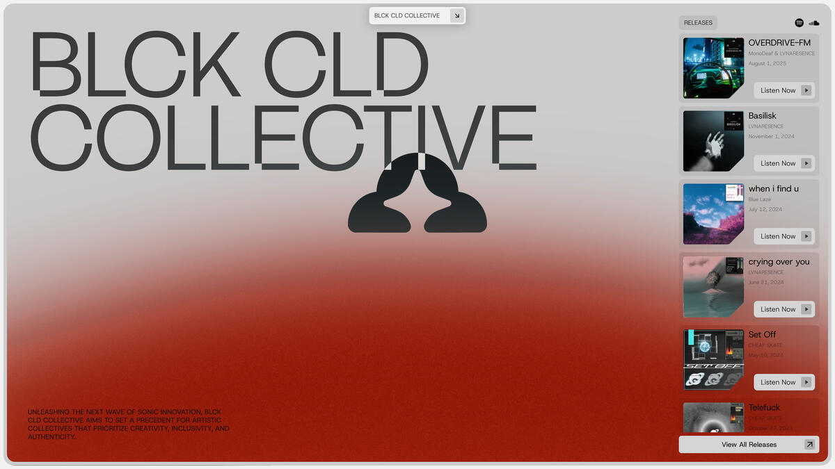
blckcldcollective.com
Unleashing the next wave of sonic innovation, BLCK CLD COLLECTIVE aims to set a precedent for artistic collectives that prioritize creativity, inclusivity, and authenticity.
Stack
| Ycode | Website builder, CMS & Hosting |
| GSAP | Animation |
| Lenis | Animation |
| Fonts | Stack Sans Notch, Geist |
Project
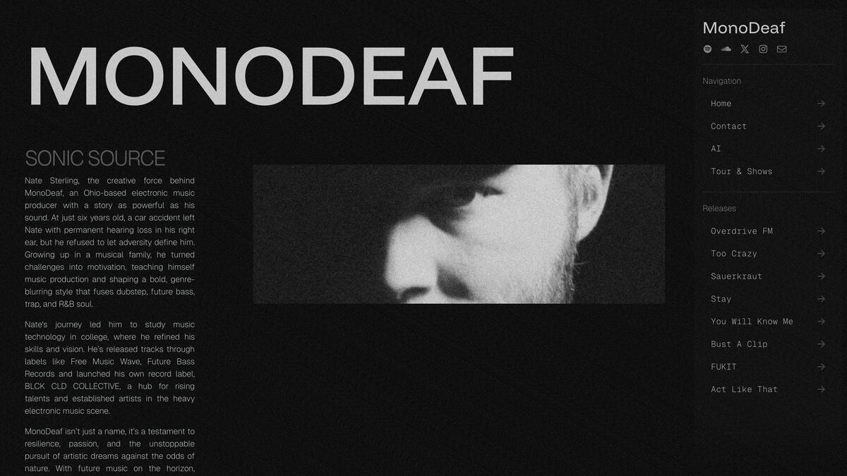
monodeaf.com
MonoDeaf is the project of half-deaf underground electronic producer, Nate Sterling, known for blending heavy bass with experimental elements that showcase resilience and unique artistry.
Stack
| Carrd | Website builder & Hosting |
| GSAP | Animation |
| Fonts | Instrument Serif (Italic), Geist |
Project
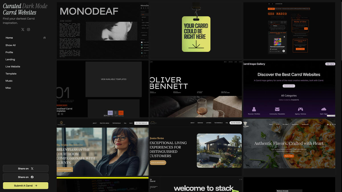
darkdesigns.carrd.co
Find your darkest Carrd inspiration.
Stack
| Carrd | Website builder & Hosting |
| Lenis | Animation |
| Fonts | Instrument Serif (Italic), Funnel Display |
Project
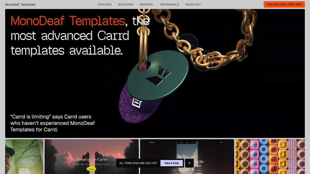
templates.monodeaf.com
The most advanced Carrd templates on the web.
Stack
| Carrd | Website builder & Hosting |
| GSAP | Animation |
| Fonts | Geist Pixel, Geist |